
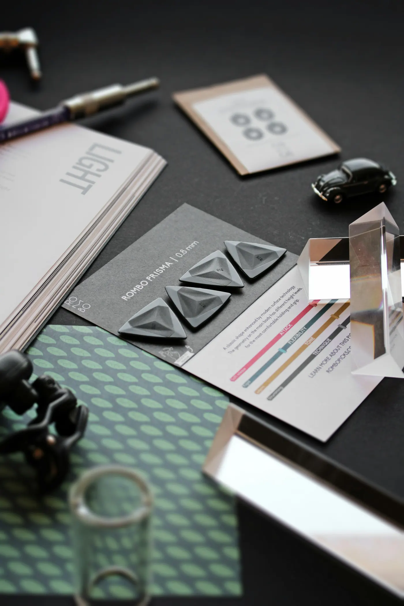

Building a strong brand image in the modern era demands visual simplicity that remains easily recognizable across various media channels. Amidst the hustle and bustle of overly vibrant and chaotic visual exposures in the commercial marketplace, design approaches prioritizing form reduction succeed in capturing attention much more effectively. Thoughtfully crafted simplicity delivers message clarity while affirming the innate confidence of a brand.
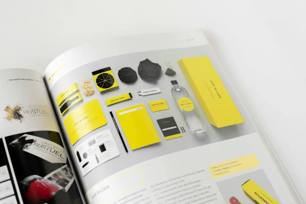
Photo by Brands&People on Unsplash
"Monochromatic color simplicity is the highest form of clarity and brand confidence."
The application of a monochromatic color palette—a sharp contrasting fusion of jet black, pure white, and neutral gray gradients—across logo designs, product packaging, and website layouts presents an aesthetic that feels elegant, timeless, and professional. The primary advantage of the monochrome spectrum lies in its application flexibility; logos and visual elements can be applied across various surfaces without losing structural sharpness, legibility, or core visual appeal.
"Sharp black-and-white contrast forges timeless aesthetics transcending boundaries of trends and time."
The consistent utilization of minimalist visual identities helps brands stand out and anchor themselves deeply within the core network of consumer memory. When a brand sustains disciplined visual clarity over time, perceptions of quality and luxury naturally take root within the public consciousness. The monochromatic approach is not merely a passing design trend, but a strategic decision to construct a lasting visual brand heritage immune to changing eras.
"Disciplined minimalist visual identity binds consumer memory more deeply and enduringly."
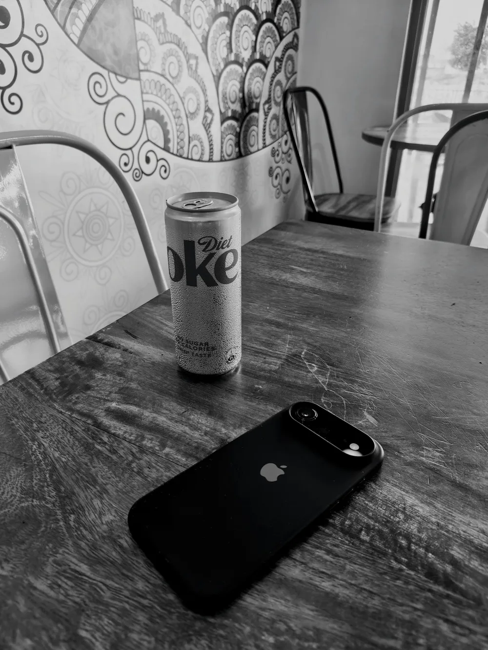
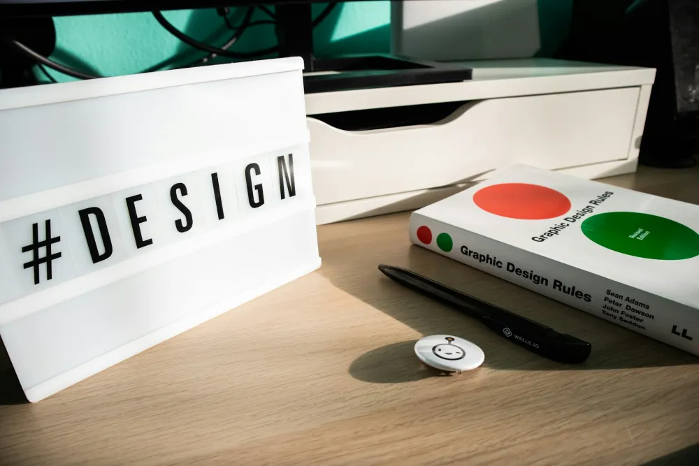
Photo by Miom _0326 on Unsplash
WRAP-UP!
Reviewing The Importance of Choosing a Monochromatic Color Palette in Brand Visual Identity reinforces Branding & Identity x Logo Design, proving that minimalist, consistent coloring strategies serve as primary pillars in building competitive advantage and long-term brand recognition. Explore brand identity design guides, commercial logo design trend reviews, and visual communication strategy references with Alinear Indonesia.
Ready to Elevate Your Business and Brand to the Forefront of the Digital Era?
Discover how Alinear Indonesia’s integrated Advertorial+ (Smart Publication & Smart Activation) solutions combine media PR with AI-driven intelligence and the power of storytelling to multiply your business visibility and credibility (Brand Authority). Consult your vision and growth strategy with us today. [Click Here to Begin!]